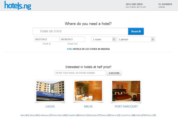
A couple days ago, Mark Essien, founder and CEO of Hotels.ng tweeted that his startup, had just received a new lick of paint. In case it wasn’t already obvious, Hotels.ng allows people book Nigerian hotels online.
Our website redesign is live http://t.co/ZNUFbCd2ip
— Mark Essien (@markessien) September 9, 2013
The new Hotels looks better than the old Hotels. Less bland, admittedly a bit more busy, and yet more intuitive. It promises to work better too.
But beyond splashing on a pretty new paint job, specific motivations often inform a website’s redesign. In this case, a desire to pull away from recent high-powered competition on the general experience maybe? In response to feedback from customers? Or perhaps another task on the product development roadmap just got checked off?
“I think every tech product should constantly iterate towards a better product”, Mark says. “The redesign has always been on the roadmap. Even now, the next design is being planned already.”
Some of the most obvious user facing improvements the new site sports include –
Less typing – the new Hotels does what it can to reduce the cognitive friction occasioned by typing, by introducing giant clickable pictures that lead to the most popular destinations and implementing a much more powerful autocomplete feature that suggests not only towns but also hotels to the user.
“One thing that I always found surprising on our site is the lengths people would go to not type anything in the search field”, Mark says. “If they wanted to find a hotel in Ogun state for example, instead of typing Ogun in the search field, they would rather scroll to the bottom and then click the Ogun State link.”
Less (useless) clutter – Those who’ve followed Hotels’ progress since its beta in 2011 might remember an interactive map to the right side of the website. It’s been gone for a while now, but Mark explains why they got rid of it
“Our old site had this maps on the right hand side like hipmunk when searching. Circa 98% of people never used that map! Roughly half of the office could not even figure out how google maps works! Maps are not obvious user interfaces at all in Nigeria. So I eliminated it completely”.
Improved discovery and access – town listings have been moved out of a dropdown where they used to live onto the right side of listings pages, mobile works better, images are better optimised.
New hotel reputation metric – Hotels now informs a prospective guest how many people have recently booked a hotel. The idea is to reassure them that they are making a good choice and improves the chances of a conversion for well trafficked hotels.
Perhaps there are some UI/UX/product insight in these that Nigerian startups can learn from?
The new Hotels still maintains a decidedly “bootstrappy” feel, and I think it could still use a much more tasteful aesthetic. Mark however makes a point of noting that the redesign is not necessarily about the site looking better, and that a lot of it had to do with harmonising and streamlining their booking channels (website and phone) as well as other processes at the backend.
“We have written over 45k lines of code on back-end management software. Basically, the software that runs on the back-end allows the company to run without my intervention”.
Hotels’ CrunchBase page lists the startup as founded in 2012, although the service has been online in beta since 2011. The startup was recently buoyed up by a capital injection from SPARK that allowed it move operations to Lagos, acquire more staff and deepen relationships with hotels across the country. 4581 hotels are currently listed on the site. Hotels claims to currently do more bookings in one day than they did in the entire month of January.
The best of TechCabal, in your inbox weekly. Don’t miss a thing. Subscribe now.


